Data visualization is all over the place. On the hype curve, we’re clearly up in the area of inflated expectations. If you listen to the reporting, you wouldn’t be blamed for thinking dataviz is going to bring world peace! I’m writing to beat the drum in favor of more informal presentations. You can tell better data stories, and engage your audience more, by creating less formal data presentations.

Some Examples
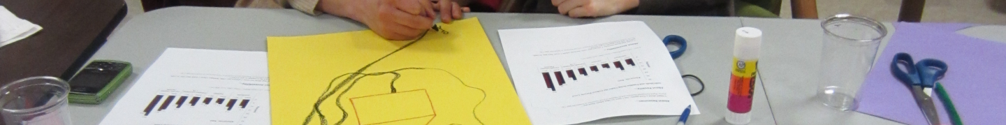
What do I mean by “informal visualization”? To start, toss out your computer, printer and graph paper. Pull our your crayons, big paper, tape, and your imagination.

From top-left, clockwise:
- One of Jose Duarte’s physical visualizations
- Willow Brugh’s illustration for my Food Resuce blog post
- Sebastion Errazuriz’s “American Kills” mural
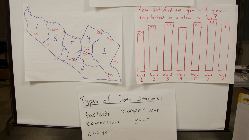
- An illustration from my Data Therapy blog
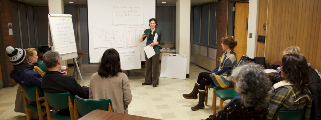
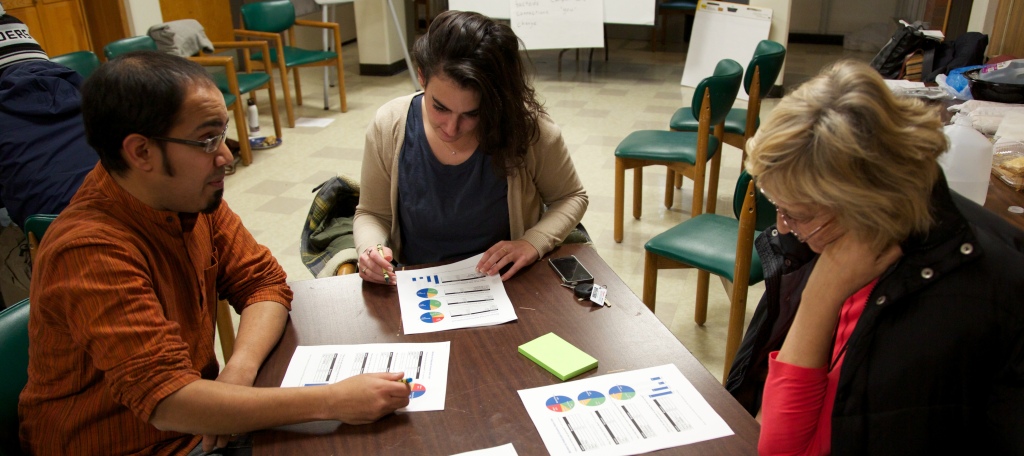
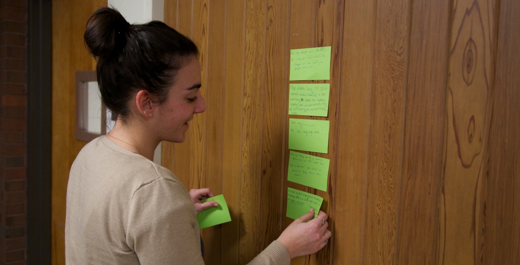
Another example is the Data Mural pilots I’ve been doing with artist, facilitator (and my wife) Emily Bhargava. We’re leading groups through finding a story in their data, creating a collaborative visual design for a mural, and then painting it! (read more on my Data Therapy blog and Emily’s Connection Lab blog).
Stuff Academics Say
I work at a university, so I have to mention some of the research in this area. First up – there is a great paper out of the City University of London, called “Sketchy Rendering for Information Visualization“. Basically, they get a computer to draw graphs as if they had been drawn by hand. My main takeaway was that their “sketchy” graphs engaged people more than the more “official” looking ones with straight lines.

Secondly, the Data Stories podcast had a recent episode called “Data Sculpture” in which they spoke with people investigating physical data presentations. If you listen to it, be prepared for a lot of academic jargon – their audience is not the general public. My main takeaway from the paper referenced (“Evaluating the Efficiency of Physical Visualizations“) was that when people physically touched the 3d objects representing the data they did a better job understanding the data.

It’s Arts & Crafts Time
Beyond these examples, and academic rationale, making informal visualizations is just flat out more fun. As with most things, I think there is a cultural issue involved here. Western culture has an inexplicable (to me) emphasis on professionalism and looking like an expert. When I’ve worked in Central America, South America, and India I’ve found the professions more welcoming to informal data presentations like those I show above. Perhaps this was due to resource constraints, but it almost always led to better sessions.
Whie doing my master’s in the Lifelong Kindergarten group here at the MIT Media Lab, I fully joined the tribe that talks about how making physical things is the best way to communicate your ideas. This “constructionism” approach has feuled all my work since then, and I see this call for informal visualization as a way to bring it to the dataviz world.
So what does this mean in practice? For me, I’ve taken to doing less on the projector and more on paper. I encourage community groups I work with in Data Therapy sessions to partner with local artists and schools. I push businesses and organizations to thing about their audience and goals harder before jumping into making data presentation. (PLUG: come to my “Fight the Bar Chart” meetup here in Boston to learn more about that)
If you want to look like a “sage on the stage”, by all means be as formal as you can. However, if you want to engage your audience around a data story, try having some art and crafts time before your next data presentaton.
Cross-posted to the MIT Civic for Civic Media Blog


You must be logged in to post a comment.