Finding Data Stories

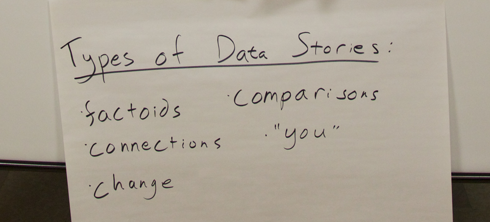
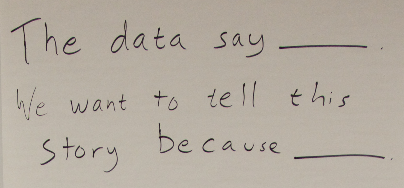
Many people have written about techniques for telling data driven stories (1).  However, I’m struggling to find a similar list of techniques to help people in finding stories in their data.  To do that you need to have a sense of what kind of data stories can be told. Here’s my current take at a few categories of data stories that can be told (expanding on earlier thoughts I had written about).  I use this list to help community groups find stories in their data that they want to tell.  Each includes a real example based on data scraped from the Somerville tree audit (the town I live in). All of these techniques benefit from existing statistical techniques that can be used to back up the pattens they illustrate.  You can find stories of factoids, connections, comparisons, changes over time, and personal connections in your data.

Factoid Stories

There’s only one Eastern Redbud tree in all of Somerville! What’s the story of that tree?  Turns out the leaves change to bright pink in fall, but everything else it yellow and orange.

An Eastern Redbush tree (from Wikipedia – not the actual tree in Somerville)

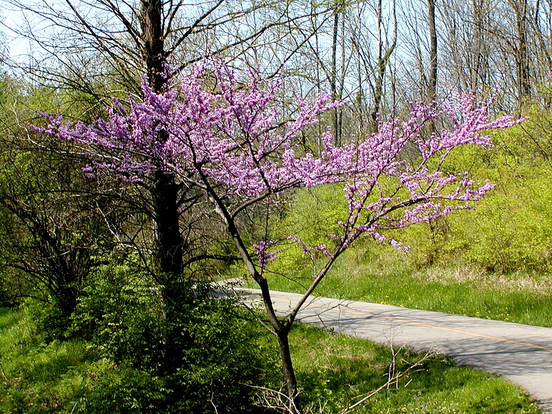
Sometimes in large sets of data you find the most interesting thing is the story of one particular point.  This could be an “outlier” (a data point not like the others) like the Redbush example above, or it could be the data point that is most common (can we tap more of the Maple trees that dominate Somerville?).  Going in depth on one particular piece of your data can be a type of data story that fascinates and surprises people.

Connection Stories

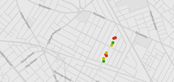
How come Somerville Ave has some many trees in the best condition? Oh, it was recently renovated… that is why those are all new trees.  There’s a story about more aesthetic outcomes of big street resurfacing projects.

a map of somerville with healthy trees in green (created in TableauPublic)
A map of somerville with healthy trees in green (created in TableauPublic)

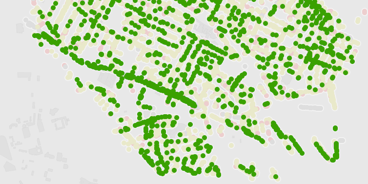
When two aspects of your data seem related, you can tell a story about their connection.  The fancy name for this is “correlation“, and you of course need to be careful attributing causes for the connection.  That said, finding a connection between two aspects of your data can lead to a good story that connects things people otherwise don’t think about together.
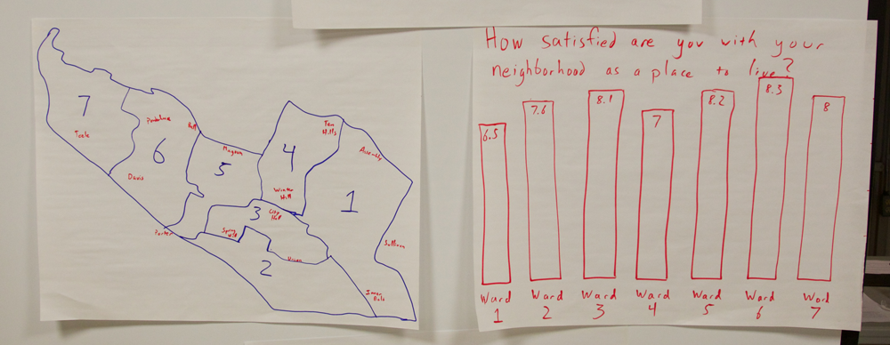
Comparison Stories

Walking down Somerville Ave. gives you a good sense of the most populous trees across the city.  That street is a good representative of the tree population in the city as a whole.  Is your street different?

Comparison of tree populations in the city and along one street (large bubbles mean more trees)

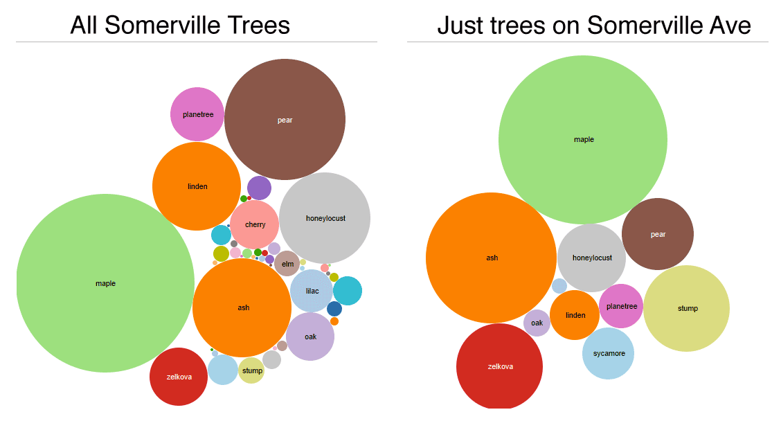
Comparing between sections of your data can a good way to find an illustrative story to tell.  Often one part of your data tells one story, but another part tells a totally different story. Or, as in this example above, maybe there is a more human slice of your data that serves as an exemplar of an overall pattern.

Stories of Change

Turns out there was a big die-off of trees in 2008.  Was the climate weird that year? (I made this up since I don’t have any time-based data)

People like thinking about things changing over time.  We experience and think about the world based on how we interact with it over time.  Telling a story a story about change over time appeals to people’s interest in understanding what caused the change.

“You” Stories

You live on Highland Rd? Did you know that ALL 9 Spruce trees in Somerville are on Highland Rd? Maybe we should rename it “Spruce Rd”?

Map of spruce trees on Highland Rd, colored by tree health (created in TableauPublic)

Another way to find a story in data is to think about how it relates to your life.  People with map literacy like maps because they can place themselves on it.  This personalization of the story creates a connection to the real world meaning of the data and can be a powerful  type of story for small audiences.  Stories about your personal experiences can be grounding and real.

In Conclusion…

This is just one take on the type of data stories that can be told.  Please let me know how you think about this! Telling that story effectively is a whole different topic, but I find the story finding exercise much easier when I introduce a bunch of categories like this.  Most of these benefit from multiple sets of data, so remember to go data “shopping” during your story finding process.

Footnotes:

(1) For instance, I’m a huge fan of Seger and Heer’s Narrative Visualization paper, where they give a catalog of visual storytelling techniques.  Also good is Marije Rooze’s thesis work (particularly the tagged gallery of visualizations from the Guardian and New York Times).

Tools for Data Scraping and Visualization

Over the last few weeks I co-taught a short-course on data scraping and data presentation for.  It was a pleasure to get a chance to teach with Ethan Zuckerman (my boss) and interact with the creative group of students! You can peruse the syllabus outline if you like.

In my Data Therapy work I don’t usually introduce tools, because there are loads of YouTube tutorials and written tutorials.  However, while co-teaching a short-course for incoming students in the Comparative Media Studies program here at MIT, I led two short “lab” sessions on tools for data scraping, interrogation, and visualization.

There are a myriad of tools that support these efforts, so I was forced to pick just a handle to introduce to these students.  I wanted to share the short lists of tools I choose to share.

Data Scraping:

As much as possible, avoid writing code!  Many of these tools can help you avoid writing software to do the scraping.  There are constantly new tools being built, but I recommend these:

  • Copy/Paste: Never forget the awesome power of copy/paste! There are many times when an hour of copying and pasting will be faster than learning any sort of new tool!
  • Import.io: Still nascent, but this is a radical re-thinking of how you scrape.  Point and click to train their scraper.  It’s very early, and buggy, but on many simple webpages it works well!
  • Regular Expressions: Install a text editor like Sublime Text and you get the power of regular expressions (which I call “Super Find and Replace”).  It lets you define a pattern and find it in any large document.  Sure the pattern definition is cryptic, but learning it is totally worth it (here’s an online playground).
  • Jquery in the browser: Install the bookmarklet, and you can add the JQuery javascript library to any webpage you are viewing.  From there you can use a basic understanding of javascript and the Javascript console (in most browsers) to pull parts of a webpage into an array.
  • ScraperWiki: There are a few things this makes really easy – getting recent tweets, getting twitter followers, and a few others.  Otherwise this is a good engine for software coding.
  • Software Development: If you are a coder, and the website you need to scrape has javascript and logins and such, then you might need to go this route (ugh).  If so, here’s a functioning example of a scraper built in Python (with Beautiful Soup and Mechanize).  I would use Watir if you want to do this in Ruby.

Data Interrogation and Visualization:

There are even more tools that help you here.  I picked a handful of single-purpose tools, and some generic ones to share.

  • Tabula: There are  few PDF-cleaning tools, but this one has worked particularly well for me.  If your data is in a PDF, and selectable, then I recommend this! (disclosure: the Knight Foundation funds much of my paycheck, and contributed to Tabula’s development as well)
  • OpenRefine: This data cleaning tool lets you do things like cluster rows in your data that are spelled similarly, look for correlations at a high level, and more!  The School of Data has written well about this – read their OpenRefine handbook.
  • Wordle: As maligned as word clouds have been, I still believe in their role as a proxy for deep text analysis.  They give a nice visual representation of how frequently words appear in quotes, writing, etc.
  • Quartz ChartBuilder: If you need to make clean and simple charts, this is the tool for you. Much nicer than the output of Excel.
  • TimelineJS: Need an online timeline?  This is an awesome tool. Disclosure: another Knight-funded project.
  • Google Fusion Tables: This tool has empowered loads of folks to create maps online.  I’m not a big user, but lots of folks recommend it to me.
  • TileMill: Google maps isn’t the only way to make a map.  TileMill lets you create beautiful interactive maps that fit your needs. Disclosure: another Knight-funded project.
  • Tableau Public: Tableau is a much nicer way to explore your data than Excel pivot tables.  You can drag and drop columns onto a grid and it suggests visualizations that might be revealing in your attempts to find stories.

I hope those are helpful in your data scraping and story-finding adventures!

Curious for More Tools?

Keep your eye on the School of Data and Tactical Technology Collective.

Activities for Building Visual Literacy

There are a lot of people talking about “Visual Literacy” right now. Shazna Nessa shared some thoughts from a journalistic point of view on the Mozilla Source blog recently.  Her discussion focused on how data visualizers should consider the limitations and affordances of visual depictions of information.  I’d like to offer a complementary response from a constructionist’s point of view. Certainly the journalists and new explainers  need to understand how to best use the tools at hand,  but in addition we can help the “audience” build visual literacy by helping them create their own visual presentations of their information. The creative act of telling an information-based story offers everyone the best way to understand the affordances of various visualization tools, in addition to making them more aware consumers of this new “visual grammer”.  So how do you do this? What kind of fun activities can we do with people help them work with and present information.

Build a Data Sculpture

One classic technique to exploring a new domain is to re-use more familiar materials in novel ways.  For instance, in my Data Therapy workshops I show up with a bin of craft materials and give people 5 minutes to create a physical “data sculpture” that depicts a tiny set of data I share (click to see some examples).

photo

This activity is fun, engaging, and raises many presentation issues!  Inevitably some people choose to focus on one  piece of data, while others try to show it in context.  People bring their own biases to it.  All of that makes for great fodder for the discussion I do right after each person shares what they made.

Reverse-Engineer Other People’s Work

Of course, taking stuff apart is just as much fun as building it!  Another activity that both I and my friends at  the Tactical Tech Collective us is something they call the “gallery”.  You hang up a bunch of examples of visualizations and have people move through them in groups (make sure to include examples for praise and examples for critique!).  Each group gets assigned one of these questions to answer for each piece in the gallery:

  • who is the intended audience?
  • what is the information being shared?
  • how would this make the audience feel?
  • what visual techniques does it use?
  • are their any ethical or reliability issues with the presentation?

gallery-shot

Each group writes their answers on a small sticky note that they stick under the piece, so they have the be concise. Then you let everyone wander for a bit, looking at the other groups’ responses.  The discussion afterwards is a fantastic opportunity to understand the questions one has to consider when creating visual presentations of information, and creates a shared language within the group for talking about their own work.

Remix  Other People’s Work

A great follow up to this activity is to pick one item and have people remix it (we did this at the the TTC Info-Activism Camp). What do I mean by “remix”? The idea is to take the topic and data it presents, and have a brainstorming session about how to craft an appropriate message for a specific audience:

  • an online community
  • people who disagree with the point
  • people who agree but you want to motivate to action
  • policy makers
  • people within the system being depicted

We broke participants into small groups and assigned each an audience to remix for.  People sketched out ideas quickly on paper and then shared them back with the group.  This let participants exercise the reflective muscle we developed in the gallery activity.

Think about Impact

You can do more than just LEGO bricks and pipe cleaners.  If you want to focus on evidence and persuasion, the Tactical Tech Collective has a great exercise I co-faciliated recently.  They first introduce an issue and some related information (for instance, the idea of conserving water and data about water use in home, industry, food production, etc.) Then a handful of participants are brought up to represent various audiences that are involved in the issue and you might want to influence (politicians, companies, food producers, citizens).  These audiences are lined up according to how much they care about the issue.  Then the fun part – everyone proposes, off the top of their heads, arguments that try to move folks.  So people make arguments to the audience representatives, and if the arguments is persuasive the person physically moves down the line to being “more convinced”.  I found that this kind of constructive brainstorming activity brought some of the abstract ideas about “influence” into the real world, making them actionable for people when they get back to their day jobs.

Why Making?

The common thread connecting  these activities is engaging people together around the process of visually presenting information. I’ve done all these activities a few times now, and have enjoyed the results after each one. People’s insights into visual presentations they see are directly connected to their experiences of producing their own.  I worry about statements that simple presentations of information are the “right” answer… I don’t disagree that they can be effective, but we can expect more of our audiences.  I believe giving people creative opportunities to build their own visualizations for their own cause is the way to do better.

Jer Thorp, a visualization expert I respect, recently wrote that to make all this data more human 

people need to understand and experience data ownership

I completely agree.  This will address the potentially disempowering nature of data for those that don’t “speak data”.  I hope these types of activities help bridge the gap between the “new explainers” and the so-called “data illiterate”.

Cross-posted to the MIT Center for Civic Media blog.

Being Data Informed

Earlier this summer I sat in on a webinar by Beth Kanter on running a “Data Informed” organization.   Here are some reflections on her topic.

I talk a lot of about creative ways to present data-driven stories, but you have to have data to get there.  Many organization and community groups are still thinking about how to integrate data gathering into their work.  For those folks, and everyone else, I suggest taking a look at Beth Kanter’s latest book – Measuring the Networked Nonprofit.

Book Cover

She runs through a process for going form crawling to flying with your data.  This approach of growing engagement over time is a great way to think about integrating data into your organization’s behavior.  For many groups this is about culture change, not one time data expeditions.

2013-05-02_1422
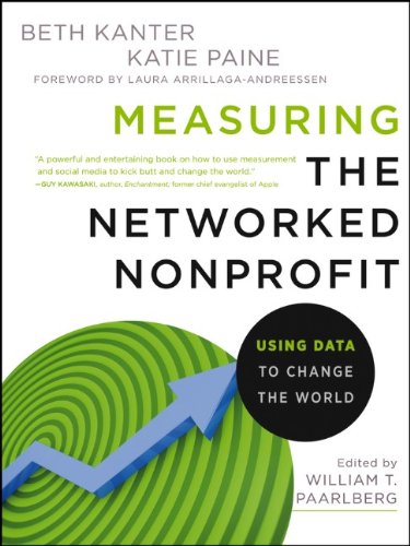
Even better, she gave examples about how to create reasonable metrics for campaigns that involve social media.  This kind of guidance is invaluable because it gets past some of the hand-waving about follower counts and so on.
2013-05-02_1449


In all this, she uses the term “data-informed”.  What’s up with that?  Beth says this is important because:

Data-informed cultures are not slaves to their data.

I like that.  I think I may need to embrace this term more, because it better reflects how I think this work.

The Power of the Explanatory Comparison

Even if your visual data presentation looks awesome, that doesn’t mean the message is getting across.  One reason this happens is that sometimes the numbers don’t mean anything to the audience; they don’t have the number in a context they can relate to. This is one of the powers of map-based presentations: viewers can often place themselves in the map say things like “let me compare my town to the next one over”.  That offers a relevant context for the information.  So how do you do this with raw numbers?

Recently, I attended the OpenVis Conf event here in Boston.  It was a fantastically nerdy collection of smart folks talking about visualization.  One of the speakers was Amanda Cox, from the New York Times.  One of the ideas she touched on was the concept of the “Kooky Comparison” (check out the video of her talk if you have an hour to spare). She particularly likes graphics that include this comparison of a piece of information to something else in a silly or surprising way.  For instance, comparing the cost of printer ink to the cost of blood!

Ink Costs More Than Human Blood

I loved Amanda’s reminder.  Turns out, non-profit speak has a name for this!  The Institute for Sustainable Communities at Berkeley called this technique social math.  Cute name!  Like my map example from earlier, the idea is to offer the audience a relevant context for the information (read some more on ImpactMax or SightlineDaily).

Even better, Glen Chiacchieri built a Chrome browser plugin called The Dictionary of Numbers.  It looks at the webpage you are reading, and if it finds quantities in the text it tried to automatically insert a comparison in human terms:

So cool! I’d say this offers relevant, and irrelevant comparisons that set the number in context 🙂

Getting back to the point… if you find your story muddled by questions of scale and context, try a comparison (kooky or not) to make the number relevant and understandable to your audience

Going to Data Camp!

I recently attended the 2013 Info-Activism Camp as a facilitator on the “Curation” track.  The Tactical Technology Collaborative organized the event for over 100 information activists from around the world.  Everyone was there to learn about Evidence & Influence.  Yes, it was awesome.

I’ve mostly been working on Data Therapy in isolation, because I haven’t been able to find others working on capacity building for creative data presentation with community organizations. That all changed at an isolated camp in Northern Italy a few weeks ago!  I connected with a network of technologists, activists, and rabble-rousers that were thinking deeply about this topic.

IMG_5965Attendees pondering which of the awesome sessions to attend after the morning circle.

What’s InfoActivism Camp?

What happens when you bring 100 information activists from around the world to a remote retreat in the north of Italy? We affectionally called it “organized chaos”.  The organizers, Tactical Tech, have been sharing best practices in information advocacy since 2003. They run events around the world, helping activists learn how to create compelling visuals that tell their stories and advocate for their causes. Their fantastic “Visualizing Information for Advocacy” guide will be coming out in extended book-form soon. They’ve done a handful of large-scale “Camp” gatherings, the last in Bangalore in 2009. It truly is camp – we all eat, sleep, play, and work together!

What is “Curation”?

IMG_5970The large paper encouraging people to come join our curation & influence track.

I was invited to help facilitate the “Curation” track, which focused on how to use information to sway hearts and minds. You know, the easy stuff 🙂 I was excited because this parallels my Data Therapy work so closely, so I hoped to share and learn in equal parts! I worked with my co-facilitators, Stephanie Hankey (of TTC) and Tin Geber (from the Land Coalition), to create an agenda for the week that was tailored to the participants interests.

IMG_5993
Our framing questions.

Of course, this was just one of 4 tracks that filled the mornings. The afternoons were filled with peer-to-peer skill-shares, and hands-on labs that focused on skill building with particular tools (for visualization, digital security, data inestigation, etc).

Reflections

I found the event to be just the right mix of “organized chaos” – there was a strong skeleton that set the main areas of interest, but there was ample space to change things completely based on what was working and what people wanted to learn. This is a hard balance to strike in “emergent agendas” for events; I have been part of events that have gotten it wrong a few times. This felt different, because there was strong support and collaboration from other facilitators, and the participants too (many of whom took on faciliation duties during the week).

The groundwork was laid for many exciting collaborations, built on stiking similiraties between activists across the globe. Personally, I also came away with a great set of new activities, approaches, and examples for my Data Therapy workshops. Keep an eye on my Data Therapy blog to learn more about those, and upcoming workshops I plan to schedule.  It was a treat to directly help people again, and to be reminded that you can’t disconnect presentation from the influence you want to create.

Cross-posted to the Civic Media blog.

Data Day

I recently hosted a Data Therapy session at Data Day 2013.  The Data Day event is a fantastic local gathering of people using data to drive community change in the Boston area. This year the event brought together academic researchers, policy makers, local organizations, and regular interested folks for one day of conversations about how to tell stories with data.

2013-07-09_1149

In addition to these types of community building efforts, the MAPC and The Boston Foundation have been building out many data-analysis and data-presentation tools to help local folks:

I certainly have concerns about data-based decision making in the civic sphere (see my thoughts on data as disempowerment), but I have a stronger belief in the the potential of data to influence people and drive change.

My workshop was small, so I had a chance to focus on helping people with their data presentations problems.  I reviewed some case-studies of various techniques, and a process, to build a shared language around data presentation.  Then we broke out into groups to brainstorm possible solutions for people’s actual data presentation needs!

Activities to Rethink “Visualization”

In my Data Therapy workshops I focus on redefining what “data visualization” means.  Most people think of complicated pictures with dots and lines, or snappy info-graphics with big numbers.  I argue that more informal data presentation can help you engage your audience in the data story you are telling.  Towards that goal, I show up to workshops with a big box of craft materials – LEGOs, pipe cleaners, and more!

photo

Here are some pictures from last night’s NetSquared meetup.  I showed people a little bit of the data from the Somerville Happiness Survey.  Then I paired them up and gave them 5 minutes to turn the craft materials into a presentation of data. This activity serves as a great ice-breaker, and resets the boundaries of what counts as a data presentation.  More importantly, it’s fun. Let me know if you have ideas about other activities that I could use!

Helping a Community Find Stories in Their Data

My Data Mural work has led me into a new area – actually helping community groups find the stories they want to tell in their raw data.  Until now, all my data therapy work has focused on how to present the data-driven stories more creatively.  This post shares some of the techniques I’m trying out.

Step 1: Speak like a normal person

I know, it should be obvious, but too often when entering the realm of data-anything, we fall back into using big words.  That doesn’t fly when working with community groups that don’t have a shared meaning for those words. I tried to figure out how to use regular words to talk about the types of stories that you can look for.  I came up with this set to start with:

typesofdatastories

  • comparison: you see two pieces of data that are really interesting when compared to each other
  • factoid: you see one fact that jumps out at you as particularly interesting or startling
  • connection: you see a connection between two pieces of info – you can’t say one causes another, but they’re interesting when put together
  • personal: you have a compelling story or picture that is about one person
  • change: you see one of your measures changing over time

I used regular words to describe the types of data stories in order to make the activity less intimidating to non-data people. Many people nodded their heads as I described these categories (especially at the second workshop where I spoke about them better!).  I was inspired by the Data Stories section of the Data Journalism Handbook.

Step 2: Try it out together first

To come up with a shared definition of what these types of stories meant, I showed a few data points from an amusing data set – the Somerville “Happiness Survey” (raw data).

happiness-data

We quickly tried to find stories of each type in this tiny data set.  Practicing all together on a tiny dataset can create a shared language for finding stories in data. In the breakouts that followed this activity, I could hear people using some of these words with each other to talk about the data they were looking at.

Step 3: Use less data

Usually data analysis starts with a giant set of documents.  This model doesn’t really work for a small community group made up of people that aren’t data nerds.  For our “story-finding” workshops we culled down the full data they gave us, producing a 4-page data handout for people.  Limiting the data helped the community group not be overwhelmed by the task of finding a story they wanted to tell. We definitely made some “editorial” decisions that limited the stories they could find, but we did this with the help of a smaller group of our community partners so it wasn’t arbitrary.

So how did it go?

We scaffolded the story-finding around the idea of telling a story in our “The data say____” format.  This gave us a common way to talk about the stories with each other.  Just as importantly, this forced each person to justify why they thought it was a compelling story to tell in mural form.

thedatasaySo did we build the group’s capacity for data analysis?  Our pre-post survey did NOT show a noticeable increase in people’s self-assessed ease of finding stories in data. Damn. But wait… the answer is probably more nuanced than that.  They did say they came away with more knowledge about the topic the data was about.  They also said one of the most interesting things they learned was “telling data stories”, and in each of these two pilots they came out with a data-driven story that they wanted to tell.

Is exposure to data story-finding  a sufficient outcome?  Am I trying to do too much capacity building all at once?  I’m still pondering how to do this better, so please suggest any tips!

Curious about these pilots?  You can read some more on my collaborator Emily’s Connection Lab blog:

Cross-posted to the MIT Center for Civic Media blog.