Many people have written about techniques for telling data driven stories (1). However, I’m struggling to find a similar list of techniques to help people in finding stories in their data. To do that you need to have a sense of what kind of data stories can be told. Here’s my current take at a few categories of data stories that can be told (expanding on earlier thoughts I had written about). I use this list to help community groups find stories in their data that they want to tell. Each includes a real example based on data scraped from the Somerville tree audit (the town I live in). All of these techniques benefit from existing statistical techniques that can be used to back up the pattens they illustrate. You can find stories of factoids, connections, comparisons, changes over time, and personal connections in your data.
Factoid Stories
There’s only one Eastern Redbud tree in all of Somerville! What’s the story of that tree? Turns out the leaves change to bright pink in fall, but everything else it yellow and orange.

Sometimes in large sets of data you find the most interesting thing is the story of one particular point. This could be an “outlier” (a data point not like the others) like the Redbush example above, or it could be the data point that is most common (can we tap more of the Maple trees that dominate Somerville?). Going in depth on one particular piece of your data can be a type of data story that fascinates and surprises people.
Connection Stories
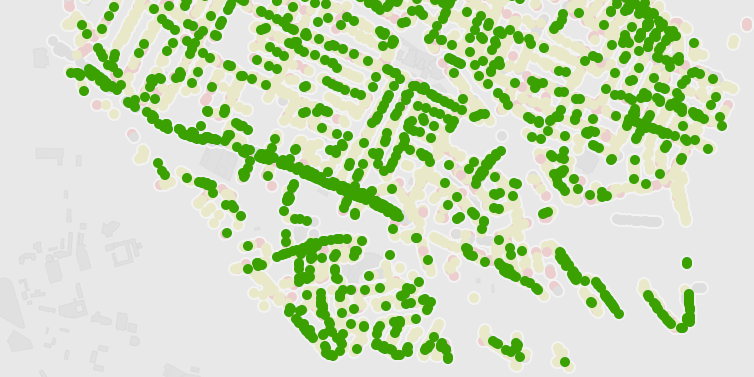
How come Somerville Ave has some many trees in the best condition? Oh, it was recently renovated… that is why those are all new trees. There’s a story about more aesthetic outcomes of big street resurfacing projects.

When two aspects of your data seem related, you can tell a story about their connection. The fancy name for this is “correlation“, and you of course need to be careful attributing causes for the connection. That said, finding a connection between two aspects of your data can lead to a good story that connects things people otherwise don’t think about together.
Comparison Stories
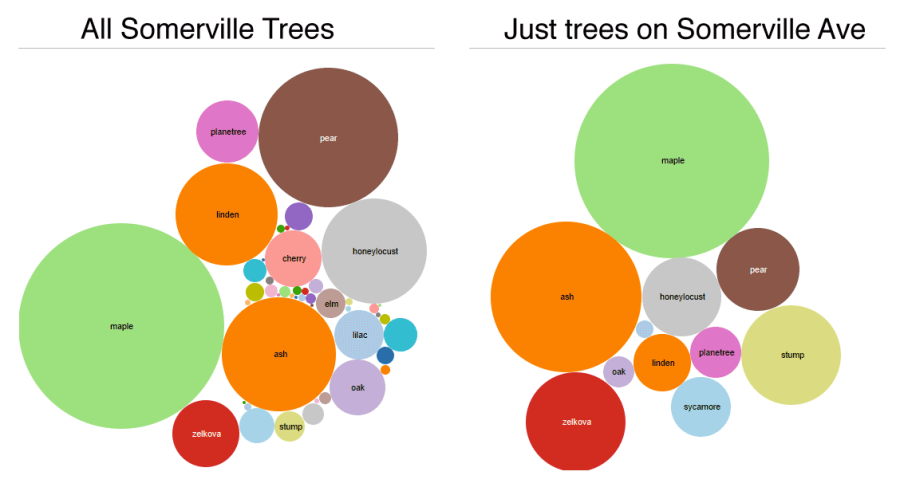
Walking down Somerville Ave. gives you a good sense of the most populous trees across the city. That street is a good representative of the tree population in the city as a whole. Is your street different?

Comparing between sections of your data can a good way to find an illustrative story to tell. Often one part of your data tells one story, but another part tells a totally different story. Or, as in this example above, maybe there is a more human slice of your data that serves as an exemplar of an overall pattern.
Stories of Change
Turns out there was a big die-off of trees in 2008. Was the climate weird that year? (I made this up since I don’t have any time-based data)
People like thinking about things changing over time. We experience and think about the world based on how we interact with it over time. Telling a story a story about change over time appeals to people’s interest in understanding what caused the change.
“You” Stories
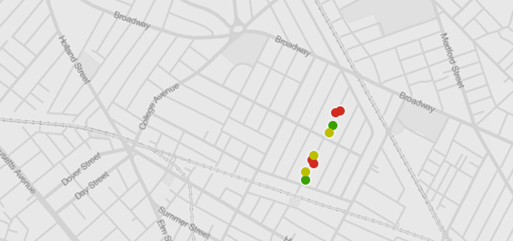
You live on Highland Rd? Did you know that ALL 9 Spruce trees in Somerville are on Highland Rd? Maybe we should rename it “Spruce Rd”?

Another way to find a story in data is to think about how it relates to your life. People with map literacy like maps because they can place themselves on it. This personalization of the story creates a connection to the real world meaning of the data and can be a powerful type of story for small audiences. Stories about your personal experiences can be grounding and real.
In Conclusion…
This is just one take on the type of data stories that can be told. Please let me know how you think about this! Telling that story effectively is a whole different topic, but I find the story finding exercise much easier when I introduce a bunch of categories like this. Most of these benefit from multiple sets of data, so remember to go data “shopping” during your story finding process.
Footnotes:
(1) For instance, I’m a huge fan of Seger and Heer’s Narrative Visualization paper, where they give a catalog of visual storytelling techniques. Also good is Marije Rooze’s thesis work (particularly the tagged gallery of visualizations from the Guardian and New York Times).

3 thoughts on “Finding Data Stories”
Comments are closed.