Tool Evaluation Matrix

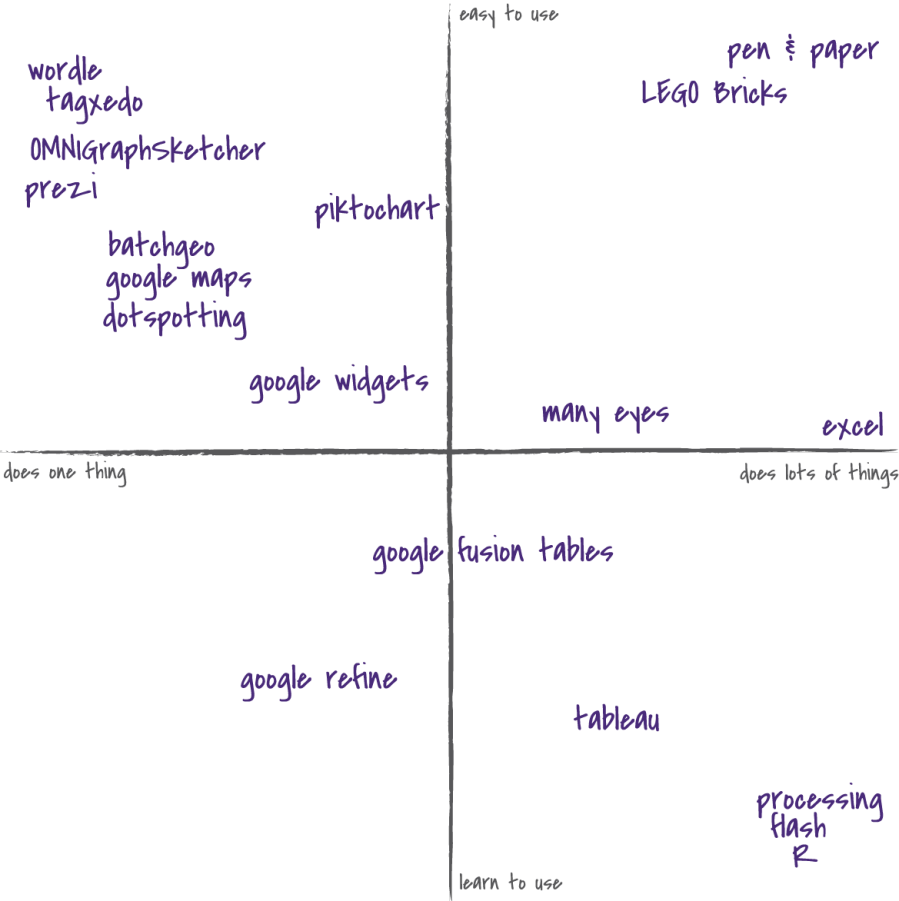
There are a lot of tools being created to help novices create data presentations.  Honestly it is hard to evaluate which are worth learning, and which are just too cumbersome.  To give a sense of this space, for the last few years I’ve been using this tool matrix as a way to navigate that space with community organizations.

I’ve got it on two axes – the vertical is about how easy the tool is to learn, the horizontal is about how many things the tool does.  This is an incomplete on purpose – my goal isn’t to measure each tool by some arbitrary units of “ease of use”.  I want to have a representative map of the space that helps people figure out what a tool can do for them.

I’d appreciate any feedback on the utility, or futility, of this map!

Webinar Follow-Up

Thanks to all those who attended – I think the webinar was a success!  We had about 50 people join us, and discussed a lot of great questions.  It went well, except the computer we setup to record it crashed!  So I’m upset that we don’t have a recording. In any case, below is some followup information.

Presentation

You can click to see the presentation I made on prezi.com, but here it is too:

Please note that this isn’t meant to stand alone as a presentation, but can serve as a handy reference if you want to remind yourself or share the ideas with someone.

Tools & Resources

Here are links to the things I mentioned:

  • Prezi: Present content in a way that more closely models how presenters and audiences understand things
  • BatchGeo: Quickly go from a spreadsheet of addresses to a map, including options to aggregate content by some field of your data
  • ColorBrewer2: Pick color palettes appropriately based on the type of data you are showing (then use those colors in Excel)
  • ColourLovers: Find nice color palettes for your graphic design projects (I use this one all the time!)
  • Many Eyes: Upload your data and create lots of different types of interactive visualizations of it
  • ComicLifeSuperLame: Create comic strips by adding talking bubbles to your photos
  • Handmade Visualizations: Use regular craft tools to bring your data representation back into the real world
  • TagxedoWordle: Create a picture out of a large body of text, where the size of each word is determined by the number of times that word is used in the text (read some more thoughts I have about this)
  • Jing: Make narrated videos of your visualizations, and mark up screenshots with text and arrows
  • Google Fusion Tables: Upload your data in spreadsheet form and visualize it in lots of different ways
  • Visualizing Information for Advocacy: Guide to creating info-graphics to support activism
  • Tools for Online Storytelling: Big list of websites that help you tell your story online with various media

Feedback

If you attended, please leave a comment with any feedback or ideas.  This was our first webinar, so we’re open to suggestions about the format, content, or anything else.  We’re trying to measure our impact, so I’ll have another post coming soon about our assessment results from this webinar and previous workshops.

Word Clouds for Fun and Qualitative Data Analysis

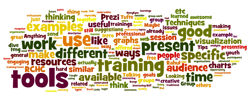
A number of services have sprung up on the web to generate “word clouds” – pictures showing each word in a body of text, where the size of word is based on how frequently the word is used (you can read more about their history on wikipedia). Word clouds are a great way to visualize qualitative data you have – interviews, quotes, etc. Typically you go through some kind of “coding” process to figure out what the common topics are between responses.  World clouds offer another path – automatically showing you the most commonly used words by making them bigger.  Here’s an example word cloud – made out of feedback from my last set of workshops:

Two of my favorite websites that offer this are Wordle and Tagxedo.  Wordle is simpler, but less powerful (I used it to make the picture above).  Tagxedo is more complex, but offers the awesome option to have your cloud be in the shape of an image you upload.

Why You Should Use Word Clouds

Word clouds are a fun way to explore and share your text-based data. I suggest using them as an introduction to a topic area, allowing you to give a general overview with a compelling visual before diving into specifics.  Make a poster of a word cloud in the shape of your logo, built out of your mission statement.  Present a word cloud picture of all your free-text survey responses to find out the common topics, present the image as an overview and then share one or two evocative quotes.