
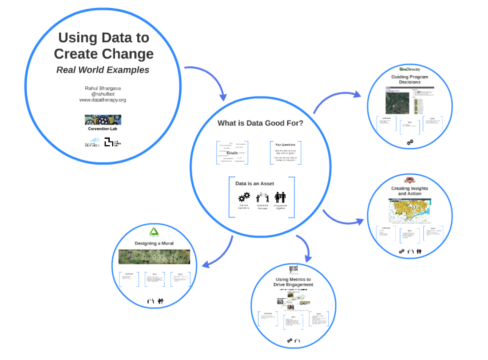
I recently led a short session at the inspiring Southern Poverty Law Center called “Using Data to Create Change: Real World Examples”. Here is a short write-up of some of the examples I shared.
The hype around data has reached such heights that it is in danger of going into low-earth orbit! Being drenched in stories about the potentials for data to change your organization and your work, it is sometimes hard to pick apart the motivations and reasons to using data. Unlike my blog title suggests, I’m not here to argue that data is good for “absolutely nothing”. I like to look at data as an asset for your organization, but focus in and talk about how it can help you in three concrete ways:
- You can use data to improve internal operations
- You can use data to spread the message
- You can use data to bring people together
Here are four short stories to help pick these apart. I live and work here in the US, so these case studies are all American.
Designing a Mural
Groundwork Somerville is a organization that works in my hometown here in Somerville, Massachusetts in the US. One of their big projects involves reclaiming unused urban lots and helping youth build and maintain raised beds to grow vegetables. They then sell these vegetables at cheap prices from a mobile market that visits multiple local sites weekly. For those of you in other countries, this is a big problem here in the US, where unhealthy food is generally far cheaper than healthy fresh food.
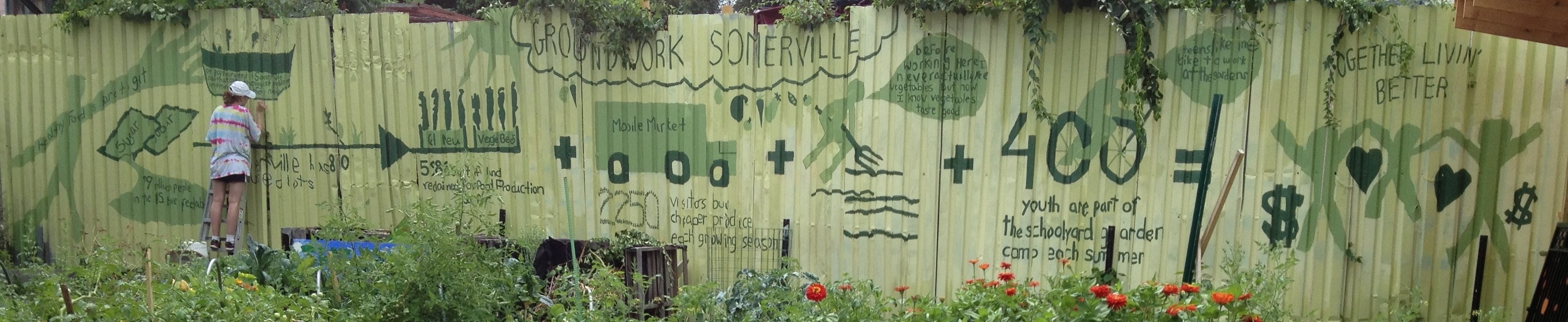
To build skills in their youth programs, share their work, argue for more support, and have fun, we worked with local youth to design and paint a Data Mural. They looked at the urban landscape, quotes from youth in the program, public health data, and participation in the mobile market to craft a story and mural speak to the internal and externals impacts the program has.
We used this kind playful engagement of data to bring people together and spread the message.
Using Metrics to Drive Engagement
Here I’m going to retell a story that is often pointed to, most succinctly in Beth Kanter’s Measuring the Networked Nonprofit. This is the story of how online news site Grist.com uses social media metrics and other data to move people up their ladder of engagement. Grist tries to bring a light, playful, and new framing to issues that are important to folks who care about the environment. Folks that might not self-identify as “environmentalists” per say.
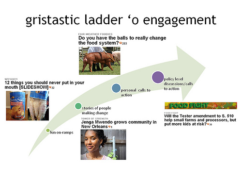
Grist does deep dives into their web and social metrics to understand what is important to their readers from a short-tem and long-term point of view. They try to respond to these interests with editorial decision-making and sometimes in near-realtime content generation. Grist uses a strong ladder of engagement to prompt people to engage and own the narratives of stories about environmental issues, knowing that that will make them more likely to act to solve problems.
This attention to metrics and constant checks of their ladder of engagement is a great example of using data to improve internal operations and spread the message. Read more about this in the book Measuring the Networked Nonprofit (by Kanter and Paine).
Creating Insights and Action
Their third story I want to share is about a small company in Detroit called LoveLand Technologies. Over the last few years Detroit has been a city in crisis, recording record foreclosure rates, stuck with barely functioning public utilities, and having to file for bankruptcy protection. In this context LoveLand stared making some simple maps of property in tax-related distress and foreclosure. These were maps of people losing their homes.
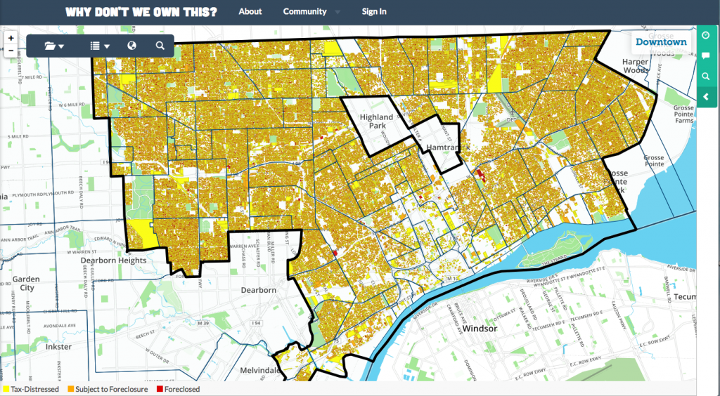
Before they knew it, their maps were being used in a variety of unforeseen ways. Government officials were relying on them as the data source of record. Churches were using them to raise funds for their neighbors in need. Folks with deep pockets were ready to give them money to do even more work around urban blight in the city.
Their data was being used to improve internal operations, spread the message, and bring people together! If you want to learn more read Ethan Zuckermen’s liveblog of a talk Mike Evans did recently at the MIT Center for Civic Media.
Guiding Program Decisions
My last story is the most high tech. It comes from DataKind, and organization that pairs data scientists with nonprofits to think through and implement projects focused on data analysis. GiveDirectly started working with DataKind to get help targeting their unconditional cash transfers to those the money could help the most. They’re a very data-centric organization already, so working with DataKind volunteers on some advanced topics just made sense!
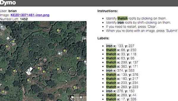
Data scientists Kush Varshney and Brain Abelson worked with GiveDirectly to understand how satellite imagery could be analyzed by computers to identify areas where aid funds would best be directed. Based on the existing research showed a strong correlation between a villages wealth and the number of iron (vs. thatch) roofs, they created an algorithm that attempts to count iron and thatch roofs in satellite imagery. It is important to note that it doesn’t quite work yet, but it is important to think about novel applications for data mining that can create new types of data to help your work. Hopefully they can continue to tune the algorithm to improve their results and turn into a useful tool.
This analysis and tool building is trying to improve internal operations so GiveDirectly can do their work better. Watch their technical talk to learn more.
Wrapping Up
There are just a handful of my favorite stories to illustrate the variety of ways you can use data to help you make change in the world. Are their counter-examples illustrating the perils and pitfalls of using data in any of these ways. Of course. I strive to highlight those stories just as often… but that’s a list for a different blog post! I hope these four help you start to think about creative and new ways your organization might be able to turn all the data hype into something useful.
For reference, here’s a link to the presentation that went along with this talk:

You must be logged in to post a comment.