The Power of the Explanatory Comparison

Even if your visual data presentation looks awesome, that doesn’t mean the message is getting across.  One reason this happens is that sometimes the numbers don’t mean anything to the audience; they don’t have the number in a context they can relate to. This is one of the powers of map-based presentations: viewers can often place themselves in the map say things like “let me compare my town to the next one over”.  That offers a relevant context for the information.  So how do you do this with raw numbers?

Recently, I attended the OpenVis Conf event here in Boston.  It was a fantastically nerdy collection of smart folks talking about visualization.  One of the speakers was Amanda Cox, from the New York Times.  One of the ideas she touched on was the concept of the “Kooky Comparison” (check out the video of her talk if you have an hour to spare). She particularly likes graphics that include this comparison of a piece of information to something else in a silly or surprising way.  For instance, comparing the cost of printer ink to the cost of blood!

Ink Costs More Than Human Blood

I loved Amanda’s reminder.  Turns out, non-profit speak has a name for this!  The Institute for Sustainable Communities at Berkeley called this technique social math.  Cute name!  Like my map example from earlier, the idea is to offer the audience a relevant context for the information (read some more on ImpactMax or SightlineDaily).

Even better, Glen Chiacchieri built a Chrome browser plugin called The Dictionary of Numbers.  It looks at the webpage you are reading, and if it finds quantities in the text it tried to automatically insert a comparison in human terms:

So cool! I’d say this offers relevant, and irrelevant comparisons that set the number in context 🙂

Getting back to the point… if you find your story muddled by questions of scale and context, try a comparison (kooky or not) to make the number relevant and understandable to your audience

“Physicalize” Your Data

There are lots of people excited about fancy-pants computer-generated data pictures right now, but I want to remind you that doing things in the physical world can often be more compelling.  Externalizing our ideas into real objects gives us something we can interact with and talk around with other people. Here’s a concrete example.

This photo shows a soda bottle filled up with just the amount of sugar in that drink.  This is a bit of a classic public health example; most people are surprised at the amount of sugar in a soda.  Representing this physically brings home the idea that when you drink the bottle, you’re consuming that amount of sugar.  A bar chart would be far less compelling, and you wouldn’t be able to relate to it.  This is a simple example, but the underlying concept is clear.

What You Should Do:

Consider whether your data can be brought off the page (or screen).  We live in an interactive, three-dimensional, world so you should be creative about bringing your data presentation into it. Surprising your audience with a novel display can engage them long enough for you to tell the rest of your story.

Background Information:

Here’s my standard breakdown of this data presentation:

  • Who – group advocating for healthy eating decisions
  • Goal – inform the audience about the amount of sugar they consume when drinking a bottle (and possible change their behavior)
  • Audience – general public
  • Data – photos of things they would like to change, quotes from patients about their experiences
  • Technique – “physicalize” the data
  • Tools – soda bottle and sugar

Evocative Photos

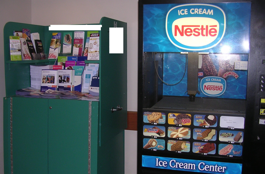
If you have qualitative data, you can use it to effectively personalize your data story. Here is a concrete example from a group advocating for changing the built environment to support people making healthy decisions (you can learn more about this topic from the Prevention Institute).

This photo shows a cabinet with brochures about making healthy eating decisions placed right next to an ice cream vending machine.  This striking visual irony is good at getting people’s attention!  Opening with this kind of evocative image can catch people, giving you a few minutes of their attention to convince them that you’re worth listening to. This image consistently sparks engaged discussion from various audiences – including off-topic ones here at MIT about how awesome it is that the ice cream machine has a robot suction arm!

What You Should Do:

Look around.  Take pictures.  Think about how you can use an evocative photo to engage your audience around the point you are trying to make.

Background Information:

Here’s my standard assessment of the process that produced this data presentation (learn more about this process):

  • Who – group advocating for an environmental approach to health
  • Goal – convince the audience to change policies based on an environmental approach to healthy-decision making
  • Audience – planning committee and policy makers within a hospital
  • Data – photos of things they would like to change, quotes from patients about their experiences
  • Technique – show a compelling photo and share a story
  • Tool – Microsoft PowerPoint