Speaking Data

Here’s video and a writeup of a short 5 minute talk I gave recently at the 2014 Civic Media Conference.  I attempt to tease apart my definition of “popular data” by comparing it to the concept of “data literacy”.

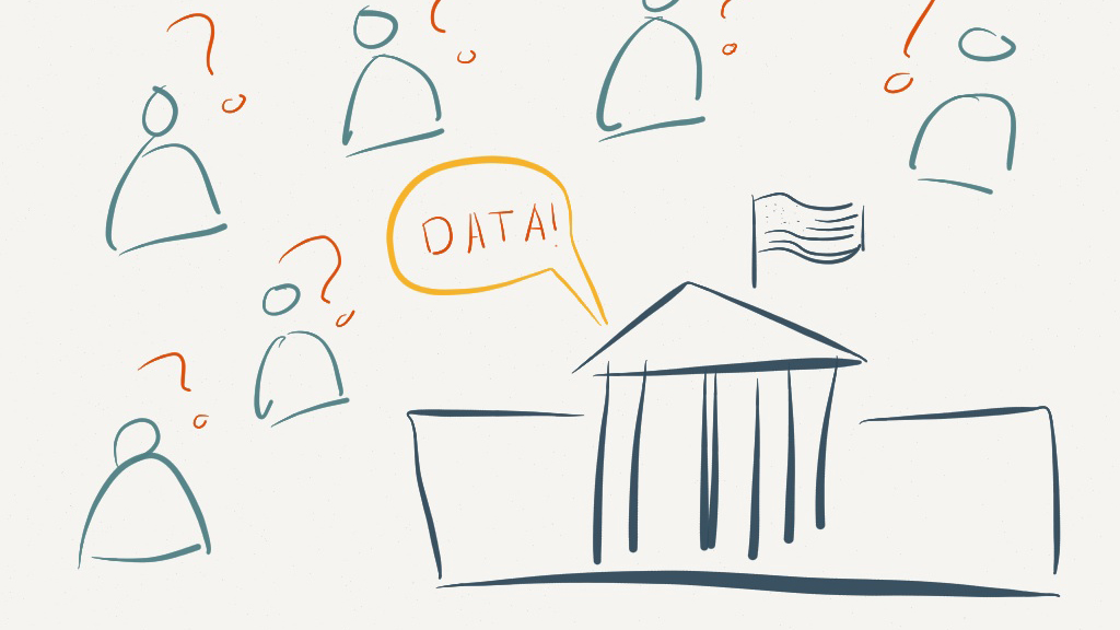
Do you “speak data”?  As more and more businesses and governments are making data-driven decisions, this question is becoming more important.  Your ability to speak data is directly related to your ability to engage with those institutions.  For governments this is a critical issue because they are meant to engage the citizenry.

image 2

Most folks try to address this, talking about it as “data literacy”, but that doesn’t quite capture the whole idea.  The concept of “literacy” suggests a spectrum:

  1. the illiterate: those that can’t participate in written discussion
  2. the readers: those that can take in the ideas of others who have written them
  3. the writers: those who can capture their ideas on paper


The idea of literacy is to move people from illiterate to reading, but the writers are those in control.  The writers are those with the power.  With data, we need to make more readers for sure.  However, the bigger issue is that we can’t just focus on readers when actually we need better writers.  This is the piece I see missing from the data literacy work misses.

So who are the existing data writers?  Newspapers, community groups, governments, businesses – they all generate data-driven stories for the readers.  So how do we make those passive readers into data writers?  Well, my studies in the Lifelong Kindergarten Group point me back to Paulo Freire, the Brazilian philosopher and educator.

image 5

Freire’s concept of popular education stemmed from his early work on adult literacy, where he focused on learning literary skills by reading local newspapers.  The ideas was that the content and context would empower the learners.

There are a few tactics of popular education that are key:

  • you must value what each individual brings to the table as a unique and meaningful addition
  • the teacher/educator is more of a facilitator for the learners
  • thought most be combined directly with action
  • the action must be tied to local community needs

So combine these tenants with the basics of data literacy and you get my new concept of popular data.  Whats the difference? Data literacy is about the what.  Popular data is about the why. 

image 14

That’s all really abstract.  Lets run through some examples of how this works in the real works.

Newspapers

Newspapers have always played a critical role informing the public.  They’ve moved this into the data-driven era by way of things like the Data Driven Journalism Handbook and numerous trainings to help journalists find and tell stories with data.  Similarly, they are experimenting with new interactive ways to write exploratory and explanatory data-driven articles.

Governments

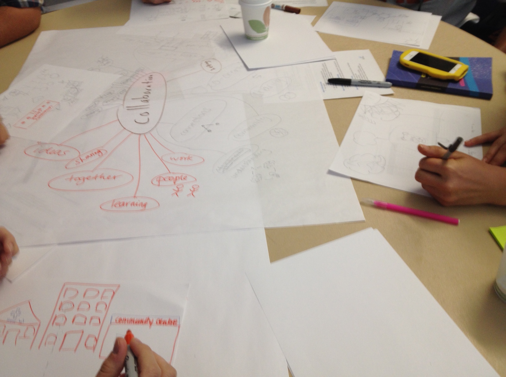
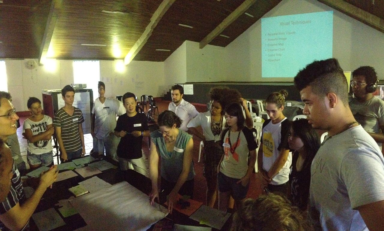
Our partners in the state government of Minas Gerais, Brazil realized that an open data portal was the start, not the end, of their open data initiatives.  They brought us down to do a series of lectures, workshops, and a data mural that tried to build local capacity to work with that data to advocate for change.  This was about turning those readers into  writers.  I argue governments, as they embrace more data-driven policy, have a moral duty to help their constituency speak data.

Community Groups

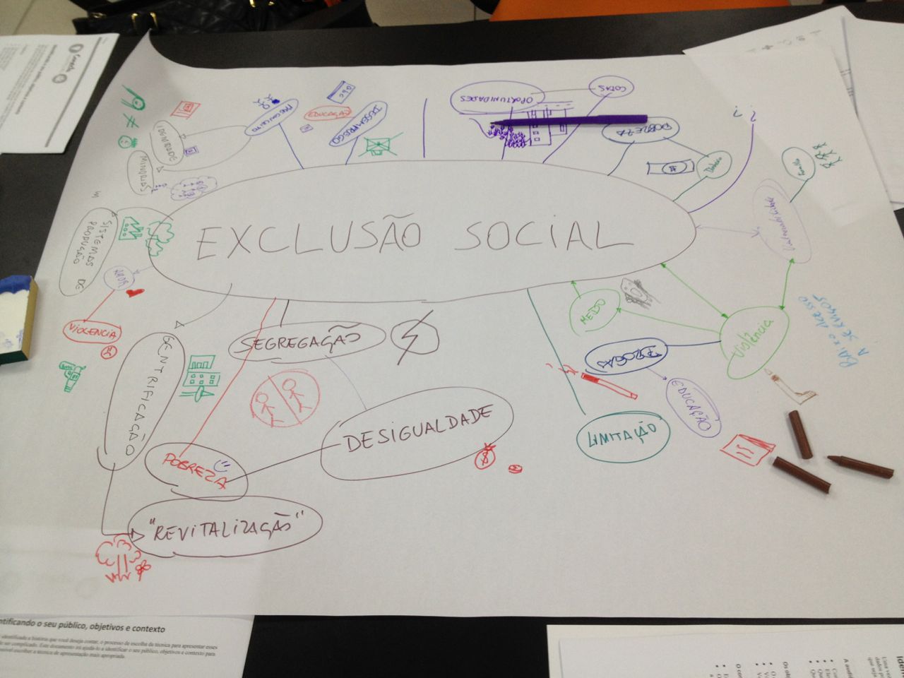
These folks could be aptly-described as semi-literate.  All Data Therapy workshops aim to build their capacity to present data in more creative and appropriate ways.  This is about making them better writers.

Regular Folks

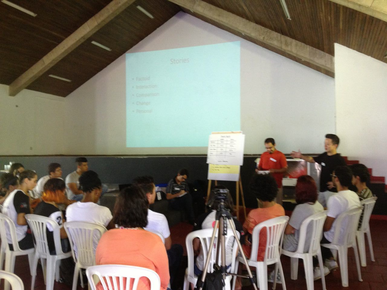
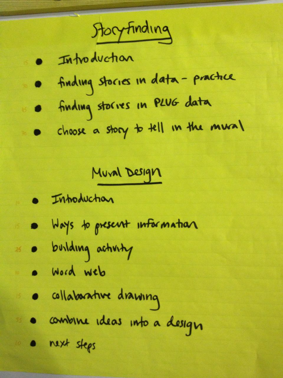
These are the “illiterate”, to a certain extent.  To help them become readers and writers, we created the Data Murals project.  We want to use the engaging power of the arts to invite them to learn to speak data.  This involves creating participatory workshops to engage them when looking at data to find a story, and then collaboratively designing a visual to tell that story, and then paint it as a mural.  This is an empowerment effort.

These are some key examples of what popular data means in practice, and why it is important to go beyond the concept of “data literacy”.

Data Murals @ Allied Media 2014

We just completed a short workshop for attendees at the 2014 Allied Media Conference in Detroit.  The attendees were mostly community activists and organizers with loads of experience, so we got some great questions about how to facilitate the activities we do.  This was our second training for trainers, and we’re hoping the participants create some neat projects with their communties!

We introduced the goals and process we use, and then led folks through our story finding activity, word webs, and collaborative drawing activities.  It was a whirlwind hour and half, but we felt like doing a little bit of each step was the right thing for this audience.

photo 1 photo 2

Here’s the presentation we gave:

AMC

And here are the handouts:

Low-Tech Data at OKFest 2014

okfest

I’m excited to be running a workshop in July at the 2014 Open Knowledge Festival!  Gabi Sobliye (from the Tactical Technology Collective) and I will be running a session called “Low-Tech Data: Story-Finding and Storytelling“.  I’m hoping it will be a good chance to connect with other folks thinking about working with small data without technology. Information-driven advocacy doesn’t need to rely on technology.

Here’s the session description:

Looking for creative ways to find and present data stories in low-tech settings? We will share our hands-on, participatory techniques for bringing people together around data to find and tell powerful stories without computers. You’ll walk away with skills and ideas to help the communities you work with!

Working with data can empower or disempower. Algorithms, technical language, unfamiliar processes – these all leave many communities incapable of working with data, or understanding data-driven discussions. Most folks don’t “speak data”.

We’ve developed and tested a set of hands-on activities that introduce finding stories in data to communities. Help us tweak them, give us your insights and experience, and lets all learn from each other!

I hope to see some of you there!

Data Murals at AMC 2014

Later this month I’ll be presenting our Data Mural work at the 2014 Allied Media Conference in Detroit.  My session is called How to Create Your Own Data Mural.  Here’s the abstract:

Looking for creative ways to present data, create art, and empower community at the same time? We will share techniques for bringing people together to tell powerful stories with data and then communicate those stories in the form of mural art. Our process can help you run workshops that lead a group through finding stories in a dataset, picking a story to tell, collaboratively designing a mural that tells the story, and painting the mural. You will walk away with the skills to facilitate the creation of a data mural in your own community!

I plan to introduce our Data Mural process, do some of our activities with participants, and give a case study of one of the murals we’ve painted.  I’m looking forward to getting new ideas and techniques from this activist audience!

Making Events Better

Most meetings and events suck.  I’m lucky enough to know lots of folks trying to make this better.  Recently Civic Media hosted Gunner from Aspiration Tech for a training on how to create and facilitate  participatory events. Afterwards I was inspired to reflect more on my own approach to facilitating the workshops and events I run. A key reflection for me was that I put a strong emphasis on the process of collaboratively making of things. Our Data Therapy workshops and events are “think with your hands” events.  Almost every topic is tied to a hands-on activity where you make something with your peers.  This is how we invite participants to engage in the material – through the process of making things.
our Data Therapy "Data Sculpture" invitation to make
our Data Therapy “Data Sculpture” invitation to make
A key role of the facilitator in any event, meeting, or workshop is get people engaged. As facilitators, we use a variety of techniques and tools to do this – creating many invitations for a diversity of participants.  I think about this as three categories of invitations: invitations to speak, invitations to move, and invitations to make.
We have various ways that we invite people to speak and listen.  Two examples:
  • we can “read” the room and invite comments from those that have been silent for a while
  • we can set ground rules about argumentation and debate, personal attacks, etc (Aspiration Tech notes on ground rules)

Other invitations rely on physical movement to engage those that otherwise might not speak.  Three examples:

  • we can do brainstorms that get people up and moving around Post-It notes on a big wall
  • we can change the physical dynamic by breaking a larger group into smaller ones
  • we can offer movement by running a spectrogram to gauge diversity of opinions on a controversial topic (Aspiration Tech spectrogram notes, P2PU-course spectrogram notes)
from Heather Leson
photo by Heather Leson
I’m proposing we think harder abut this third type of invitation, where we invite participants to make something.  Two examples:
  • we can offer the construction of a collaborative object that symbolizes the theme and is an output of the meeting or workshop
  • we can create short opportunities to make something small that explores a topic, coupled with a short window to share what was made with peers (we do this a lot in our Data Therapy workshops)
I think the invitation to make is underused in facilitation and workshops.
That said, there are a number of people I see offering this invitation in a variety of ways. Here are some of the inspirations I’m drawing from:
  • The “Maker” movement – Obviously these folks are using the process of making and sharing to build community.
  • Tactical Technology Collective – Their events invariably have hands on components with an artistic approach, but at the InfoActivism Camp 2014 I found it to be on the periphery.
  • Discotechs – I’ve recently learned more abut this model from my colleague Sasha Costanza-Chock. I understand they historically integrate the collaborative construction of a disco ball as a centerpiece activity, and their philosophy looks like it centrally integrates creative activities where you make things.
  • IISC -The facilitative leadership training I attended included a short hands-on “challenge” involving cardboard tubes, tape, etc. It was integrated well into the topic of the training, and fun.  The reflective discussion they led afterwards connected to many themes of the training.
  • Connection Lab – My wife and Data Therapy collaborator Emily does amazing work offering collaborative arts activities as a community building activity for those working the world of public health.
  • Team building – There is a large market of team building activities sold to businesses trying to focus on internal community; many of these involve creative activities.
  • Arts therapy – I understand that the world of arts therapy uses the creative act to surface underlying issues and start difficult conversations

I’m looking forward to exploring these ideas more with people here at Civic Media, and if you’re interested let me know!  Are “Making” events better?  When we provide more invitations to make, are we making events better?

Notes: This is cross-posted to the Civic Media blog.

Permission to Play

After our training-of-trainers workshop in Belo Horizonte in March, someone asked me:

How do you get a room full of executives in skirt suits or ties to play with materials from a child’s playroom?

I thought I’d take to opportunity to reflect on that question, because giving people permission to play is a critical piece of our “Data Therapy” approach.

Usually our workshops start with some introductions, where I mention my time doing a master’s degree under Mitchel Resnick in the MIT Media Lab’s Lifelong Kindergarten group.  I always introduce the educational approaches I learned there, and its connections to the Media Lab’s approach to work.

That’s right, I have an advanced degree from a group called “Lifelong Kindergarten”.  From MIT.  It’s hard to overstate the privilege this background gives me in “rooms full of executives”, or most other rooms.  I can get away with things like asking them to build with pipe cleaners, glue, and pom-poms… and they take me seriously.  Of course, I take full advantage of this, because it gives me a short window of time to convince participants that it is worth following me on this journey!

When I give folks permission to play, they take it.  The key insight I’d offer though, is that most people are looking for permission to play.  Working with data is too often rendered boring by hard-to-learn tools and stuffy restrictions on looking “official”.  People want to do interactive, hands-on activities.

The kind of privilege my MIT credentials give me is powerful, but doesn’t last long if my content isn’t relevant.  Our hands-on activities, my facilitative energy, the insights of their peers, and the content of the workshops keeps folks engaged and interested.  You can do all that without having an MIT degree! People want to play… it is up to you to give them, and yourself, permission.

A Data Mural in Brazil!

I just returned from a fascinating week in Belo Horizonte (Brazil), where we ran multiple workshops to build capacity to work with data in creative ways.  The trip was organized by the Office of Strategic Priorities of the State of Minas Gerais (they are members of the MIT Media Lab).  This post is one in a series about the workshops we ran there.

The most fun we had on our trip was designing and painting a Data Mural with students at the Plug Minas school.  This was a our standard Data Mural workshops process, compressed into just two days (including painting!).  We worked with about 15 amazing students for the design session, and then had over 50 people help during the painting day.

Interested in making your own Data Mural? Here’s an outline of our process.

IMG_3132

Process

The first day we ran a story-finding workshop, and then a visual-design workshop.  The agenda were rushed, but covered all the topics we usually cover.  This was, of course, another chance to try out some new facilitation and learning techniques.

IMG_3245

We started with a bunch of data about the school, enrollment demographics, public perception of their programs, and student satisfaction survey data.  From that data, the story-finding workshop resulted in a story they wanted to tell about how students go through a process of transformation while at Plug Minas, and come out as better people.

IMG_3233

We then facilitated a variety of activities that helped them turn that story into a visual design for a mural!

design-sketch

And then we painted it!  The video they made (at the top of this post) is an amazing view into that chaotic process 🙂

IMG_3294


photo-2-1

Reflections

Plug Minas is made up of a number of “Nucleos” – centers that focus on individual topics.  Students tend to identify with these centers, rather than with Plug as a whole.  One of the goals of this mural was to try to tell the whole Plug story, and the design they came up with definitely does that.  The story of transformation has all the Nucleos feeding into the brain in harmony!

Another goal was to try and connect Plug more to the neighborhood it is in (Horto).  One amazing way they did this was to hire an announcement car to drive around inviting folks to participate (it’s in the video above).  We had a number of community members come help paint the mural, and as we finished we pulled out a big canvas to let others draw their thoughts about the neighborhood too!

IMG_3337

On a different note, language is hard.  We struggled to facilitate some of the more interactive conversations.  For instance, when narrowing down to one story, or combining ideas into one visual design.  Luckily, Emily’s 1 year of Portuguese training helped her a ton – so she led those sessions.  That said, it was still incredibly difficult to hear all the ideas and summarize connections back to the group.  Facilitation like this is difficult in English already!  Our collaborators, Ricardo and Guillerme, were AMAZING as translators.

Here’s Emily’s quick write up about the mural.  Plug posted some pictures too.

A Training on Activities to Play with Data

I just returned from a fascinating week in Belo Horizonte (Brazil), where we ran multiple workshops to build capacity to work with data in creative ways.  The trip was organized by the Office of Strategic Priorities of the State of Minas Gerais (they are members of the MIT Media Lab).  This post is one in a series about the workshops we ran there.

As a followup to our large lecture in Belo Horizonte last week, we selected about 50 participants to join us at a hands-on workshop (called “Conecta Mais”).  The goal was to introduce a handful of activities that participants could run to empower their communities to find stories, and present, data in creative ways.  This was really our first opportunity to do a little training-of-trainers, so we were excited!  The event was generously hosted on the top floor of the SEED startup accelerator building.

IMG_7479

Content

We planned the agenda to introduce four of our hands-on facilitation activities.  We did each for about 15 minutes, shared results with each other for 10, and then reflected together for 10 about how it went, and how participants might use it in their communities.

You can download a handout describing these activities, and how to run them.

Build Data Sculptures

The idea of playing with data is new to most people.  This activity lets people quickly build sculptures that tell a simple data story with craft materials.  The playful approach to the data helps engage the participants in thinking about how stories can be found and presented quickly and helps people feel more freedom and flexibility about data presentations.

IMG_7443   IMG_7438

We introduced a tiny dataset and spread out traditional kids craft materials over each table.  Participants broke up into teams of 3 or 4 and had 5 minutes to build a quick physical/visual representation of that data using the materials.

Here are some pictures from a previous time we ran this activity.

Remix an Existing Visualization

The goal of this activity is to practice the various techniques for presenting data.  This gives participants a “toolbelt” of techniques they can use to tell a data story, helping them feel more confident that they can present data creatively.

IMG_7453

We introduced an infographic visualization and gave printouts to each group (of 3 or 4).  We assigned each group one of the presentation techniques we ran through during the lecture, and gave them 10 minutes to come up with a way to present that same data using a different technique.

Make Some Word Webs

Abstract ideas are hard to picture, and even harder to draw.  A word web is a tool for exploring abstract ideas.  This activity gives participants a way to turn abstract ideas into concrete images, allowing them to move from numbers to pictures to engage new audiences.

IMG_7465

Each group got a big piece of paper and came up with an abstract concept to put in the middle of it (poverty, social inequality, etc).  They got 4 minutes to write words on the paper that were connected, and then another 3 to try and draw whatever they could next to the idea.

Make Data Storybooks

Storytelling is an art form, and we don’t get to practice it very much.  This activity lets participants practice putting a data story together into a narrative, like a storyteller would.  It lets people sketch their story and play with different ways to tell it in a fun storybook form, creating a narrative that can tell their stories in a convincing way.

IMG_7492  IMG_7481

Each small group received a big piece of paper to fold into a storybook.  Each book had to start with “Once Upon a Time…” (ie. “Era Uma Vez…”).  Groups got 10 minutes to write and draw a short story about the small dataset we introduced.

Here’s a blog post I wrote about this activity previously.

Group Therapy

The event closed with some “group therapy” – a hallmark of Data Therapy workshops.  We grouped the participants into threes, and then gave each person 5 minutes to share their challenges with data and storytelling with the others.  After 15 minute of sharing, each person had 5 minutes to get feedback and ideas from the other 2 for what they might do.  We specifically designed this to help build community there in Belo.  That room had a lot more expertise than Emily and I, and this was our way of trying to make those valuable connections.

IMG_7512

Reflections

This whole event was a bit of a whirlwind.  Each activity was more fun than the last as people started to get into the idea of playing with data and stories!  The reflection time after each activity was a great feedback for us about how we’ve built these activities, and many comments also pointed to the goals and pedagogy behind their design.  I felt like participants really “got it”.

The group therapy time at the end was particularly valuable.  After the lecture the night before, many folks came up to Emily and I asking questions about their projects.   We realized we hadn’t put time in the agenda for this event to do that, so we moved the agenda around and put the group therapy session back in.  Thank goodness, because people did NOT want to stop.  We announced the end of the workshop, and no one even moved!

One of the gratifying outcomes for me was that all our hosts at the Escritorio took part in this workshop as well.  They dove right in and shared their problems.  This kind of active engagement yields the best kind of partnerships.

Raquel Carmago posted some pictures on Facebook.