Ethical Data Review Procesess Workshop at Stanford

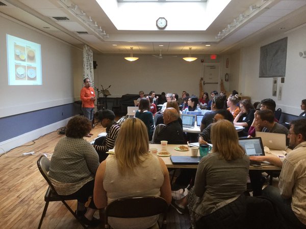
The Digital Civil Society Lab at Stanford recently hosted a small gathering of people to dig into emerging processes for ethical data review.  This post is a write up of the publicly shareable discussions there.

Introduction

Lucy Berholz opened the day by talking about “digital civil society” as an independent space for civil society in the digital sphere.  She is specifically concerned with how we govern the digital sphere in line with the a background of democracy theory.  We need to use, manage, govern in ways that are expansive and supportive for independant civil society.  This requires new governance and review structures for digital data.

This prompted the question of what is “something like an IRB and not an IRB”?  The folks in the room bring together corporate, community, and university examples.  These encompass ethical codes and the processes for judging adherence to them. With this in mind, in the digital age, do non-profits need to change?  What are the key structures and governance for how they can manage private resources for public good?

Short Talks

Lucy introduced a number of people to give short talks about their projects in this space.

Lasanna Magassa (Diverse Voices Project at UW)

Lasanna introduced us all to the Diverse Voices Project, an “An exploratory method for including diverse voices in policy development for emerging technologies”. His motivations lie in the fact that tech policy is generally driven by mainstream interests, and that policy makers are reactive.

They plan and convene “Diverse Voices Panels”, full of people whole live an experience, institutions that support them, people somehow connected to them.  In a panel on disability this could be people who live it and are disabled, law & medical professionals, and family members.  These panels produce whitepapers that document and then make recommendations.  They’ve tackled everything from ethics and big data, to extreme poverty, to driverless cars. They focus on what technology impacts can be for diverse audiences. One challenge they face is finding and compensating panel experts. Another is wondering how to prep a dense, technical document for the community to read.

Lasanna talks about knowledge generation being the key driver, building awareness of diversity and the impacts of technologies on various (typically overlooked) subpopulations.

Eric Gordon (Engagement Lab at Emerson College)

Eric (via Skype) walked us through the ongoing development of the Engagement Lab’s Community IRB project.  The goal they started with was to figure out what a Community IRB is (public health examples exist).  It turned out they ran into a bigger problem – transforming relationships between academia and community in the context of digital data.  There is more and more pressure to use data in more ways.

He tells us that in Boston area, those who represent poorer folks in the city are asked for access to those populations all the time.  They talked to over 20 organizations about the issues they face in these partnerships, focusing on investigating the need for a new model for the relationships.  One key outcome was that it turns out nobody knows what an IRB is; and the broader language use to talk about them is also problematic (“research”, “data”).

They ran into a few common issues to highlight.  Firstly, there weren’t clear principles for assuring value for those that give-up their data.  In addition, the clarity of the research ask was often weak.  There was a all-to-common lack of follow-through, and the semester-driven calendar is a huge point of conflict.  An underlying point was that organizations have all this data, but the outside researcher is the expert that is empowered to analyze it.  This creates anxiety in the community organizations.

They talked through IRBs, MOUs, and other models.  Turns out people wanted to facilitate between organizations and researchers, so in the end what they need is not a document, but a technique for maintaining relationships.  Something like a platform to match research and community needs.

Molly Jackman & Lauri Kanerva (Facebook)

Molly and Lauri work on policy and internal research management at Facebook.  They shared a draft of the internal research review process used at Facebook, but asked it not be shared publicly because it is still under revision.  They covered how they do privacy trainings, research proposals, reviews, and approvals for internal and externally collaborative research.

Nicolas de Corders (Orange Telekom)

Nicolas shared the process behind their Data for Development projects, like their Ivory Coast and Senegal cellphone data challenges.  The process was highly collaborative with the local telecommunications ministries of each country.  Those conversations produced approvals, and key themes and questions to work on within the country.  This required a lot of education of various ministries about what could be done with the cellphone call metadata information.

For the second challenge, Orange set up internal and external review panels to handle the submissions.  The internal review panels included Orange managers not related to the project.  The external review panel tried to be a balanced set of people.  They built a shared set of criteria by reviewing submissions from the first project in the Ivory Coast.

Nicolas talks about these two projects as one-offs, and scaling being a large problem.  In addition, getting the the review panels to come up with shared agreement on ethics was (not surprisingly) difficult.

Breakouts

After some lunch and collaborative brainstorming about the inspirations in the short talks, we broke out into smaller groups to have more free form discussions about topics we were excited about.  These included:

  • an international ethical data review service
  • the idea of minimum viable data
  • how to build capacity in small NGOs to do this
  • a people’s review board
  • how bioethics debates can be a resource

I facilitated the conversation about building small NGO capacity.

Building Small NGO Capacity for Ethical Data Review

Six of us were particularly interested in how to help small NGOs learn how to ask these ethics questions about data.  Resources exist out there, but not well written enough for people in this audience to consume.  The privacy field especially has a lot of practice, but only some of the approaches there are transferrable.  The language around privacy is all too hard to understand for “regular people”.  However, their approach to “data minimization” might have some utility.

We talked about how to help people avoid extractive data collection, and the fact that it is disempowering.  The non-profit folks in the group reminded us all that you have to think about the funder’s role in the evidence they are asking for, an how they help frame questions.

Someone mentioned that law can be the easiest part of this, because it is so well-defined (for good or bad).  We have well established laws on the fundamental privacy right of individuals in many countries.  I proposed participatory activities to learn these things, like perhaps a group activity to try and re-identify “anonymized” data collected from the group.  Another participant mentioned DJ Patel’s approach to building a data culture.

Our key points to share back with the larger group were that:

  • privacy has inspirations, but it’s not enough
  • communications formats are critical (language, etc); hands-on, concrete, actionable stuff is best
  • you have to build this stuff into the culture of the org

Talking Data & Uncertainty with Patrick Ball

Recently at the Responsible Visualization event put on the by the Responsible Data Forum I had a wonderful chance to sit down with the amazing Patrick Ball from the Human Rights Data Group and talk through how we help groups learn about working with incomplete data.

With my focus on capacity building, I’m trying to find fun ways for NGOs to learn about accuracy and data at a very basic level. Patrick agues that in fact you need rigorous statistical analysis to do this well, from his background in human rights data. I pushed a bit, asking him is there was a 80/20 shortcut. His response was to paint a great distinction between homogenous and heterogenous observability of data. For instance, there are many examples of questions that don’t require quantitative rigor – case existence, case history, etc.  This sparked a fun conversation about visual techniques for conveying uncertainty.

Watch the video to see the short conversation, or just catch the audio below.

What Would Mulder Do?

The semester has started again at MIT, which means I’m teaching a new iteration of my Data Storytelling Studio course.  One of our first sessions focuses on learning to ask questions of your data… and this year that was a great change to use the new WTFcsv tool I created with Catherine D’Ignazio.

wtf-screenshotThe vast majority of the students decided to work with our fun UFO sample data.  They came up with some amazing questions to ask, with a lot of ideas about connecting it to other datasets.  A few focused in on potential correlations with sci-fi shows on TV (perhaps inspired by the recent reboot of the X Files).

One topic I reflected on with students at the close of the activity was that the majority of their questions, and the language they used to describe them, came from a point of view that doubted the legitimacy of these UFO sightings.  They wanted to “explain” the “real” reason for what people saw.  They were assuming that the sightings were people imagining what they saw was aliens, which of course couldn’t be true.

Now, with UFO sightings this isn’t especially offensive.  However, with datasets about more serious topics, it’s important to remember that we should approach them from an empathetic point of view.  If we want to understand data reported by people, we need to have empathy for where the data reporter is coming from, despite any biases or pre-existing notions we might have about the legitimacy of the what they say happened.

This isn’t to say that we shouldn’t be skeptical of data; by all means we should be!  However, if we only wear our skeptical hat we miss a whole variety of possible questions we could be asking our dataset.

So, when it comes to UFO sightings, be sure to wonder “What would Mulder do?” 🙂

Talking Visualization Literacy at RDFViz

Just yesterday at I was in a room of amazing friends, new and old, talking about what responsible data visualization might be.  Organizing by the Engine Room as part of their series of Responsible Data Forums (RDF), this #RDFViz event brought  together 30 data scientists, community activists, designers, artists and visualization experts to tease apart a plan of action for creating norms for a responsible practice of data visualization.

Here’s a write up of how we tackled that in the small group I led about what that means when building visual literacy.

Building Literacy for Responsible Visualization

Scan_Jan_15_pdf__page_1_of_5_I’ve written a bunch about data literacy and the variety of ways I try to build it with community groups, but we received strict instructions to focus this conversation on visualization.  That was hard!  So we started off by making sure we understood the audiences we were talking about  – people who make visualizations and people who see/read them.  So many ways to think about this… so many questions we could address… we were lost for a bit about where to even start!

We decided to pick four guiding questions to propose to ourselves and all of you, and then answer them by sketching about quick suggestions for things that might help.

  • How can visual literacy for data be measured?
  • How can existing resources for data visualization read the growing non-technical data visualization producers?
  • How can we teach readers to look at data visualization more critically?
  • How can we help data visualization producers to design more appropriately for their audiences?

A difficult set of questions, but our group of four dove into them unafraid!  Here’s a quick run-down on each.  For the record, I only worked on two of these, so I hope I do justice to the other two I didn’t directly dig into.

Measuring Visual Literacy

Scan_Jan_15_pdf__page_3_of_5_.png

This is a tricky task, fraught with cultural assumptions.  We began by defining it down to the dominant visual form for representing data – namely classic charts and graphs.  This simplified the question a little, but of course buys into power dynamics and all that stuff that comes along with it.

Our idea was to create an interactive survey/game that asks people to read and reason about visualizations.  Of course this draws on a lot of existing research into visual- and data-literacy, but in that body of work we don’t have an agreed-upon set of questions to assess this.  So we came up with the following topics, and example questions as a thing to think about.

  1. Can you read it?  This topic tried to address the question of basic visual comprehension of classic charting.  The example question would show something like a bar chart and ask “What is the highest value?”.
  2. What would you do? This topic digs into making reasoned judgements about personal decisions based on information show in a visual form.  The example question is a line chart showing vaccination rates over time going down and people getting measles going up; asking “Would you vaccinate your children?”.
  3. What can you tell? Another topic to address is making judgements about whether data shows a pattern or not.  The example question would show a statement like “Police kill women more than men – true or false?” and the answers could be “true”, “false” and “can’t tell”.
  4. What’s the message? More complex combinations of charts and graphs are often trying to deliver a message to the reader.  Here we could show a small infographic that documents corruption somewhere.  Then we’d ask “What is the message on this graphic?” with possible answers of “corruption is rampant”, “corruption happens” and “public funds are too high”.

There are just four topics, and we know there are more.  We’re excited about this survey, and hope to find time and funds to review existing surveys that assess various types of literacies so we can build a good tool to help people measure these types of literacies in various communities!

Choosing the Right Visualization for Your Audience

Scan_Jan_15_pdf__page_2_of_5_.png
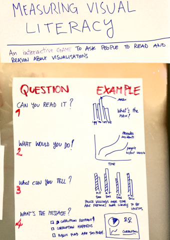
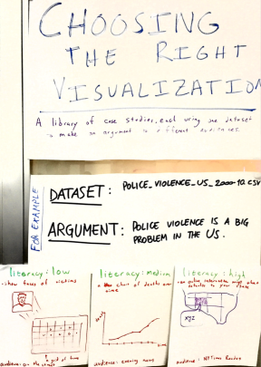
We have a vast, and growing array of visualization techniques available to us, but few guidelines on how to use them appropriately for different audiences.  This is problematic, and a responsible version of data visualization should respect where and audience is coming from and their visual literacy.  With that in mind, we propose to create a library of case studies where each one creates different visualizations from the same dataset, making the same argument, for different audiences.

For example, we sketched out ways to argue that police violence is endemic in the US, based on a theoretical dataset that captures all police-related killings.  For a low visual literacy individual (maybe a 10-year old kid) you could start by showing a face of one victim, and then zoom out to a grid of all the victims to show scale of the problem while still humanizing it. For the medium literacy audience (those that watch the evening news each night on tv), you could show a line chart of killings by year.  For a high literacy audience (reading the New York Times) you could do an interactive map that shows killings around the reader’s location as they compare to nation-wide trends.

You could imagine a library of many of these, which we think would help people think about what is appropriate for various audiences.  I’m excited to assign this to students in my Data Storytelling Studio course as an assignment!

Learning to Read A Data Visualization

Scan_Jan_15_pdf__page_4_of_5_.png
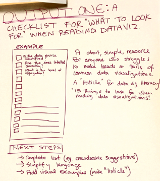
Our idea here was to create a quick how-to guide that lists things you should ask when reading a data visualization.  Imagine a listicle called “15 Things to Check in any Data Visualization”!  The problem here is that people aren’t being introduced to the critical techniques for reading visualization, to identify when one is being irresponsible.

Some things that might on this list include:

  • Is the data source identified?
  • Are the axes labelled correctly?
  • What is the level of aggregation?

This list could expose some of the common techniques for creating misleading visualizations.  Next steps?  We’d like to crowd source the completion of the list to make sure we don’t miss any important ideas.

Helping Non-Experts Learn to Make Data Visualizations

Scan_Jan_15_pdf__page_5_of_5_.png
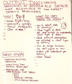
This is a huge problem.  The hype around data visualization continues to grow, and more and more tools are being created to help non-experts make them.  Unfortunately, the materials we use to help these newcomers into the field haven’t kept pace with the huge rise in interest!

We proposed to address this by better defining what these new audience need to know.  They include:

  • human rights organizations
  • community groups
  • social movements

And more!  A brief brainstorm resulted in this list of things they are trying to learn:

  • how to select the right data to visualize?
  • what types of charts are best suited to understand what types of data?
  • what cultural assumptions are reflected in what types of dataviz?
  • how do design decisions (eg. color) impact on how readers will understand your data visualization?

This is just a preliminary list of course.

Rounding it Up

Problem solved!

Just kidding… we have a lot of work to do if we want to build a responsible approach to literacies about data visualization. These four suggestions from our small working group at the RDFViz event are just that – suggestions. However, the space to approach this from a responsible point of view, and the conversations and disagreements were invaluable!


Many thanks to the organizers and funders, including our facilitator Mushon Zer-Aviv, our organizers at the Engine Room, our hosts at ThoughtWorks, Data & Society and Data-Pop Alliance, and our sponsors at Open Society Foundations and Tableau Foundation.  This is cross-posted to the MIT Center for Civic Media website.

Workshop: Communicating Impact in the Arts

I just had the pleasure of co-presenting a workshop for the National Guild for Community Arts Education with their Boston Ambassador, Kathe Swaback of Raw Art Works.  We focused on inspiring arts organizations to use their data to demonstrate their impact in creative ways.  The presentation I used is hosted on Prezi.com.

Communicating_Impact_in_the_Arts_by_Rahul_B_on_Prezi.png

I shared some powerful examples and helped them talk to each other about the challenges and successes in their organizations.

One challenge in our conversations was getting from mission, to outcomes, to ways to measure those outcomes and evaluate impact.  We took the approach of inspiring folks with ways they could communicate those data-stories once they had the data, rather than getting mired down in their individual outcome-identification processes.  The Guild is creating separate programs to help them do that, so I didn’t feel bad about taking this jump.

We practiced using different types of data presentation techniques using an excerpt from the MuralsArts PorchLight evaluation done by the Yale School of Medicine.  After scanning the handout, I assigned each small group a technique to use.

They came up with amazingly creative ways to tell the impact stories they saw in the data.  Everything from expressive data dancing, to participatory interviews where people move to answer questions!  I look forward to seeing how these organizations can adopt and try out some of these techniques.


Civic Visualization: Student Sketches

I just wrapped up teaching a 3-week, 5 session module for MIT undergraduates on Data Scraping and Civic Visualizations (read more posts about it).  As their final project I asked students to use some Boston-centric data to sketch a civic visualization.  Here’s a quick overview of their final projects, which I think are a wonderful example of the diversity of things folks can produce in a short amount of time.  Remember, these are sketches the students produced as their final projects… consider them prototypes and works-in-progress.  I think you’ll agree they did amazing work in such a short amount of time!

1.5 Million Hubway Trips

Inforgraphics_02

Ben Eysenbach and Yunjie Li dove into the Hubway bicycle sharing data release.  They wanted to understand how people perceive biking and help planners and bike riders make smart decisions to support the urban biking system. Ben and Yunjie found that Google bicycle time estimates are significantly off for female riders, and built some novel warped maps to show distances as-the-bike-rides across the city.  See more on their project website.

The Democratic Debate on Tumblr

Project_2_Presentation_-_Google_Slides

Alyssa Smith, Claire Zhang, and Karliegh Moore collected and analyzed Tumbler posts about the first 2015 Democratic presidential debate.  They wanted to help campaigns understand how to use Tumblr as a social media platform, and delve into how tags are used as comments vs. classification.  Alyssa, Claire and Karliegh found Bernie Sanders, Hillary Clinton, and Donald Trump were the most discussed, with a heavy negative light on Trump.

Crime and Income Rates in Boston

Final_Report_-_Google_Docs

Arinze Okeke, Benjamin Reynolds and Christopher Rogers explored data sets about crime and income in Boston from the city’s open data portal and the US Census.  They wanted to motivate people to think harder about income disparity and inform political debate to change policies to lower crime rates.  Arinze, Ben and Chris created a novel map and data sculpture to use as a discussion piece in a real-world setting, stacking pennies to represent income rates on top of a printed heatmap of crime data.

Should Our Children Be in Jail?

Children_in_Jail___Piktochart_Infographic_Editor

Andres Nater, Janelle Wellons and Lily Westort dug into data about children in actual prisons.  They wanted to argue to people that juveniles are being placed in prisons at an alarming rate in many states in the US.  Andres, Janelle and Lily created an inforgraphic that told a strong story about the impact of the cradle-to-prison pipeline.

Visualizing to *Find* Your Data Story

I consistently run across folks interested in visualizing a data set to reveal some compelling insight, or tell a strong story to support an argument.  However, the inevitably focus on the final product, rather than the process to get there.  People get stuck on the visual that tells their story, forgetting about the visuals that help them find their story.   The most important visualizations of your data are the ones that help you find and debug your story, not the final one you make to tell your story.  This is why I recommend Tableau Public as a great tool to learn, because its native language is the visual representation of your data.  Excel’s native language is the data in a tabular form, not the visuals that show that data.

Here are some other tools I introduce in the Data Scraping and Civic Visualization short course I teach here at MIT (CMS.622: Applying Media Technologies in Arts and Humanities).

  • Use word clouds to get a quick overview of your qualitative text data (try Tagxedo)
  • Tools Overview:find all of these on netstories.org website
  • Use Quartz ChartBuilder to make clean and simple charts, without all the chartjunk
  • Use timelines to understand a story over time (try TimelineJS)
  • Experiment with more complicated charting techniques with Raw (a D3.js chart generator)
  • Make simple maps with Google Maps, analyze your data cartographically with CartoDB, or make your own with Leaflet.js
  • Test your story’s narrative quickly with a infographic generator like Infogram

Curios for more?  See own netstories.org website for more tools that we have reviewed.

What You Should Use to Scrape and Clean Data

I am currently teaching a short module for a class at MIT called CMS.622: Applying Media Technologies in Arts and Humanities.  My module focuses on Data Scraping and Civic Visualization.  Here are a few of the tools I introduce related to scraping and cleaning.

Tools for Scraping Data

As much as possible, avoid writing code!  Many of these tools can help you avoid writing software to do the scraping.  There are constantly new tools being built, but I recommend these:

  • Copy/Paste: Never forget the awesome power of copy/paste! There are many times when an hour of copying and pasting will be faster than learning any sort of new tool!
  • Chrome Scraper Extension: This bare-bones plugin for the Chrome web browser gives you a right-click option to “scrape similar” and export in a number spreadsheet formats.
  • Import.io: This is a radical re-thinking of how you scrape.  Point and click to train their scraper.  It’s buggy, but on many simple webpages it works well!
  • Jquery in the browser: Install the bookmarklet, and you can add the JQuery javascript library to any webpage you are viewing.  From there you can use a basic understanding of javascript and the Javascript console (in most browsers) to pull parts of a webpage into an array.
  • Software Development: If you are a coder, and the website you need to scrape has javascript and logins and such, then you might need to go this route (ugh).  If so, here are some example Jupyter notebooks that show how to use Requests and Beautiful Soup to scrape and parse a webpage.  If your source material is more complicated, try using Mechanize (or Watir if you want to do this in Ruby).

Tools for Cleaning Data

If you start with garbage, you end with garbage.  This is why clean data is such a big deal. I’ve written before about what clean data means to me, but here are some tools I introduce to help you clean your data:

  • Typing: Seriously.  If you don’t have much data to clean, just do it by hand.
  • Find/Replace: Again, I’m serious.  Don’t underestimate the power of 30 minutes of find/replace… it’s a lot easier than programing or using some tool.
  • Regular Expressions: Install a text editor like Sublime Text and you get the power of regular expressions (which I call “Super Find and Replace”).  It lets you define a pattern and find/replace it in any large document.  Sure the pattern definition is cryptic, but learning it is totally worth it (here’s an online playground).
  • Data Science Toolkit: This Swiss-army knife is a virtual machine you can install and use via APIs to do tons of data science things.  Go from address to lat/lng, quantify the sentiment of some text, pull the content from a webpage, extract people mentioned in text, and more.
  • CLIFF-CLAVIN: Our geo-parsing tool can identify places, people, and organizations mentioned in plain text.  You give it text and it spits out JSON, taking special effort to resolve the places to lat/lngs that makes sense.
  • Tabula: Need to extra a table from a PDF? Use Tabula to do it.  Try pdftables if you want to do the same in Python.  A web-based option is PDFTables (made by the ScraperWiki people).
  • OpenRefine: It has a little bit of a learning curve, but OpenRefine can handle large sets of data and do great things like cluster and eliminate typos.
  • Programming: If you must programming can help you clean data.  CSVKit is a handy set of libraries and command line tools for managing and changing CSV files.  Messytables can help you parse CSV files that aren’t quite formatted correctly.

I hope those are helpful in your data scraping and data cleaning adventures!

DataPop White Paper: Beyond Data Literacy

The Data-Pop Alliance recently released a “working draft” of a white-paper I co-authored: Beyond Data Literacy: Reinventing Community Engagement and Empowerment in the Age of Data.  The paper is a collaboration with folks there, and at Internews, and attempts to put the nascent term “data literacy” in historical context and project forward to future uses and the role of data in culture and community.  Data-Pop published some of the presentation on their blog.

Beyond_Data_Literacy_2015_pdf__page_1_of_37_

The paper begin with some history – focusing on the anthropologist Claude Lévi-Strauss and his ideas about literacy being used as a weapon of those in power to ensure and educated work populace.  We move into an argument about “literacy in the age of data” being a better way to start asking questions that “data literacy”.  As I talk about often, we focus on how data should serve the purpose of greater social inclusion.  This requires a focus on the words we use to talk about this stuff (is. “information” or “data”?).  This is all built on a definition of data literacy that includes the “desire and ability to constructively engage in society through and about data”.

If you’re interested in some academic reading about the history and potential of this type of work, give it a read!  It will be especially relevant to those trying to craft policies or programs that support building people’s capacity to work with data to create change.